There was some requests on the Pentaho Data Integration forums for an example of how to generate a simple chart from a CSV file.
Sometimes people get so lost in the technology, that it’s tough to just do something pretty simple. I totally get that. Pentaho still has plenty of room for improvement on the usability, especially for people coming to the platform for the first time.
Well, here tis.
Unzip examplecsv.zip to pentaho-demo/pentaho-solutions/samples/etl/ in the sample server.
Basically, the idea is to turn a csv file (example.csv):
Year,PresentsNickReceived,PresentsRequested
2003,7,4
2004,9,8
2005,8,9
2006,11,8
into this chart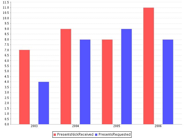
The confusing part, I’m guessing from the thread, was how data gets from KETTLE to PENTAHO.
Not hard at all actually.
Pentaho initiates (ie, calls Kettles API) the Kettle transform and then “slurps” in memory records from a specified step. It’s the UNIX equivalent of the “tee” utility where you’re just watching data arriving at a certain place. In this example, I’ve made it even more explicit by naming the “dummy” step “for_pentaho” so that it’s clear the step that Pentaho is “slurping” the data from.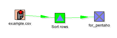
After that, it’s just a matter of building a chart like any other in the platform.
Very nice and clear example.
Thanks for another nice example.
A great start to play around with the posibilities of the design studio.
I’m new to ETL and asked by the guys to learn this tool and am now did a few exmpls in pentaho.. created transformation in spoon .. not yet used the pan chef and kitchen. this is a good example.
rajesh
Trivandrum
INDIA
I’m new to ETL and asked by the guys to learn this tool and am now did a few exmpls in pentaho.. created transformation in spoon .. not yet used the pan chef and kitchen.
rajesh
Trivandrum
INDIA
Is this example supposed to work on 1.6 GA version of BI Suite too? I do get a successful status on top and the field names but there is no chart. Am I missing something?
Thanks
Thanks for that
Very good and useful site abt open source users in BI.Really helpful and guiding to new users.
Thnks
Pravin……!
I guess this is one of those things that it would be cool to do, but us lazy folk just go out and buy excel lol