Category Archives: How To

How to Disable Drill Through on Pentaho Charts

I have some dashboard pages which show charts that are purely informational. They don’t need to click to anywhere. In fact, since I’m loading these charts via AJAX calls I do not want them to be linked. I want them to be images without any URLs and no clicks.

200810031517
All of those bars / lines etc I just want to have hovers (to see the values, but no click through locations).

However, after looking through all the documentation and code for it, I couldn’t find a single way to suppress the generation of hyperlinks for the charts. Sure, I could get the image from the ChartComponent but then I wouldn’t get the hover values. Until it occurred to me. Why not just make a URL link that does nothing?

Adding the following fragment to the chart definition can make the link, in essence, do nothing and not even refresh the page. Meets my needs.

<use-base-url>false</use-base-url>
<url-template>javascript:;</url-template>

Not ideal though. It still shows the user a clickable area so the user may think the application isn’t working properly. I think BISERVER-2222 will be better in the long term but a stop gap measure that helps my customers for sure.

Ordered Rows in Kettle

There was a question posed the other day on the Pentaho forums about how to get Kettle to process “all the rows” at one step before beginning execution on the others. Sven suggested to use the “execute once for every row” as a solution which I think is probably overall, a cleaner way to accomplish a multistep process. However, it is possible to do this in Kettle now.

The solution is to add “Blocking Step”s in your transformation where you need the whole thing to have completed before continuing processing.

Consider the following example:

200806251534

The step “block1” does not pass rows to Step2 until all rows have finished at Step1. This accomplishes the desired outcome of ensuring that all records have completed processing on step1 before step2 processes. The example transformation outputs to the debug log and it’s clear that they are output in the correct order.

2008/06/25 15:25:04 - step1.0 - Step1:1
2008/06/25 15:25:04 - step1.0 - Step1:2
2008/06/25 15:25:04 - step1.0 - Step1:3
2008/06/25 15:25:04 - step1.0 - Step1:4
2008/06/25 15:25:04 - step1.0 - Step1:5
...
2008/06/25 15:25:05 - step1.0 - Step1:499
2008/06/25 15:25:05 - step1.0 - Step1:500
...
2008/06/25 15:25:05 - step2.0 - Step2:1
2008/06/25 15:25:05 - step2.0 - Step2:2
2008/06/25 15:25:05 - step2.0 - Step2:3
2008/06/25 15:25:05 - step2.0 - Step2:4
2008/06/25 15:25:05 - step2.0 - Step2:5
...
2008/06/25 15:25:05 - step2.0 - Step2:499
2008/06/25 15:25:05 - step2.0 - Step2:500
...
2008/06/25 15:25:05 - step3.0 - Step3:1
2008/06/25 15:25:05 - step3.0 - Step3:2
2008/06/25 15:25:05 - step3.0 - Step3:3
2008/06/25 15:25:05 - step3.0 - Step3:4
2008/06/25 15:25:05 - step3.0 - Step3:5
2008/06/25 15:25:05 - step3.0 - Step3:6
2008/06/25 15:25:05 - step3.0 - Step3:7
2008/06/25 15:25:05 - step4.0 - Step4:1
2008/06/25 15:25:05 - step3.0 - Step3:8
2008/06/25 15:25:05 - step4.0 - Step4:2
2008/06/25 15:25:05 - step3.0 - Step3:9
2008/06/25 15:25:05 - step4.0 - Step4:3
2008/06/25 15:25:05 - step4.0 - Step4:4

Example here: ordered_rows_example.ktr

Using Kettle for EII

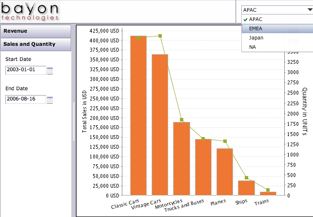
Pentaho Data Integration (aka Kettle) can be used for ETL but it can also be used in EII scenarios. For instance, you have a report that can be run from a customer service application that will allow the customer service agent to see the current issues/calls up to the minute (CRM database) but also give a strategic snapshot of the customer from the customer profitability and value data mart (data warehouse). You’d like to look a this on the same report that with data coming from two different systems with different Operating Systems and databases.

Kettle can make short work of this using the integration Pentaho provides and the ability to SLURP data from an ETL transform into a report without the need to persist to some temporary or staging table. The thing that Pentaho has NOT made short work of, is being able to use the visual report authoring tools (Report Designer and Report Design Wizard) to be able to use a Kettle transform as a source for the report during design time. That’s an important point worth repeating.

As of Pentaho 1.6, Pentaho provides EII functionality at RUNTIME but NOT at DESIGNTIME.

So, you can use an ETL transform as the source of a report, and there two examples of that. In the samples/etl directory that ships in the Pentaho BI Suite demo or you can see another example in an earlier blog entitled “Simple Chart from CSV“.

What is the best method for building reports that are going to use this functionality?

I, like others who use the Pentaho product suite, would like to use the Report Designer to build my report visually but have the data actually coming from an EII transformation. This blog is about those steps.

Step 1. Create your data set

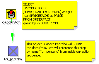
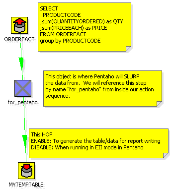
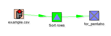
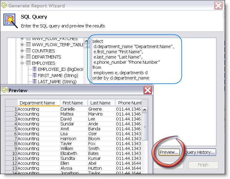
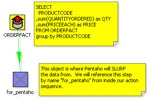
Build an ETL transformation that ends with the data you want to get on your report. Use several databases, lookups, calculations, excel files, whatever you want. Just get your data ready (use the Preview functionality in Kettle). You’d do this with Kettle 2.5.x if you want to deploy into Pentaho 1.6. I’ve created a simple ETL transformation that does something absurdly simple: generate summary sales figures by product.
200708151622
Step 2. Add a table output step to the transformation

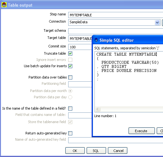
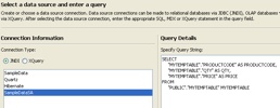
What we’re going to do now is create a table that we’ll use ONLY during design time to build our report. Just use any database that you have access to while designing the report (MySQL or Oracle XE on your local machine?). Add a table output step to the transformation and click on the “SQL” button to have it generate the DDL for the table. Go ahead and execute the DDL to create your temporary table that we’ll use for designing our report. Name the table something silly like MYTEMPTABLE.
200708151624
200708151627

Step 3. Execute the mapping and populate the temporary table

Hit run and get data into that table. Now we have a table, MYTEMPTABLE that has the format and a snapshot of data we want to use for building our report.

Step 4. Write your report using the temporary table as a source

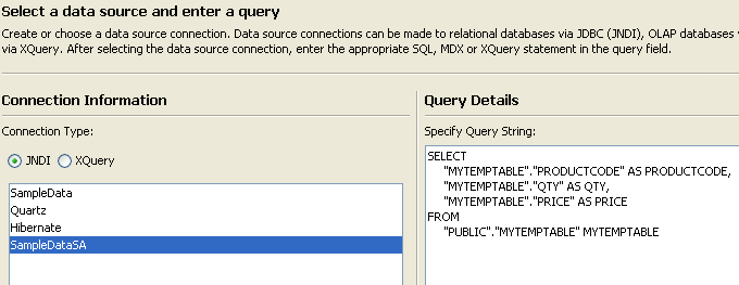
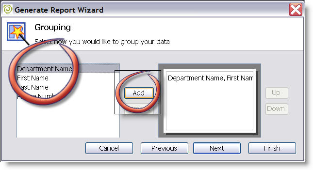
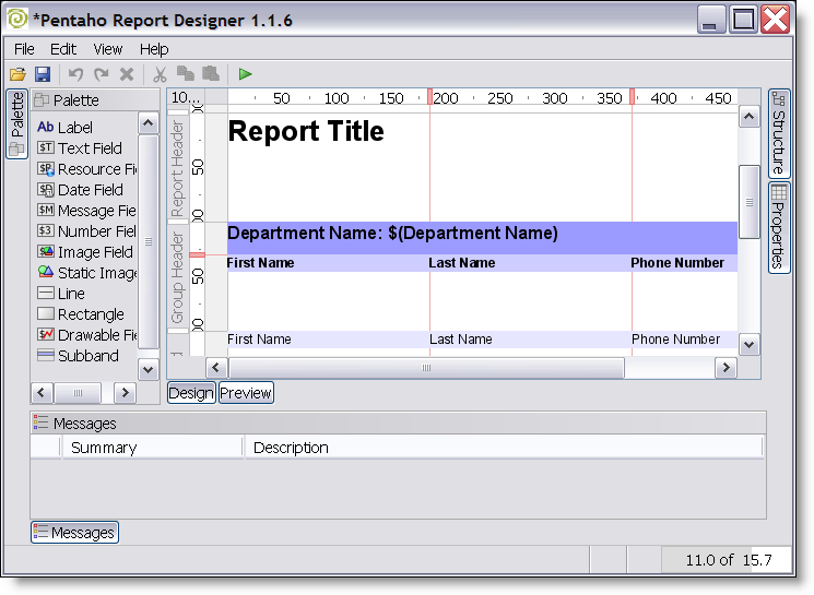
Open up Report Designer. Run through the wizard (or the Report Designer) as usual and build your report (with groupings, logos, images, totals, etc) just like you normally would. You will use the MYTEMPTABLE in your temporary database as your source for this report.
200708151631

Nothing spectacular yet. All we’ve done is write a basic report against a basic table.

Step 5. Publish your report to Pentaho server and test

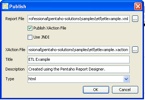
Using Publish (or Publish to Server) in the Pentaho Report Designer publish the report to the server so you can execute your report from the web using Pentaho. In this example I published the report to samples/etl so it’s alongside the example that we shipped with Pentaho demo server.
200708151634

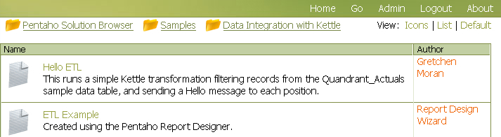
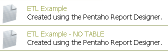
Let’s make sure that report showed up.
200708151635

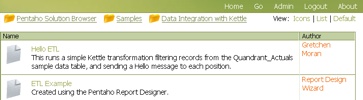
Great. Let’s click on it to make sure the report runs.
200708151636

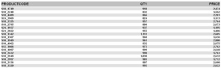
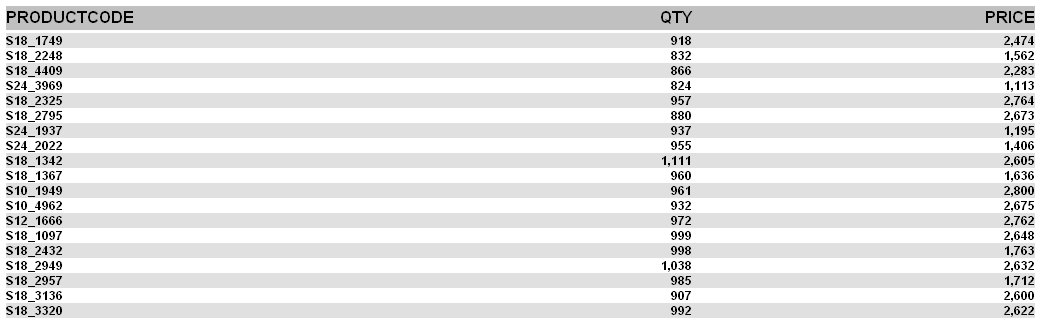
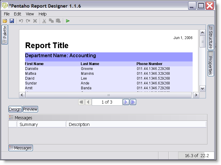
Ok. Our report (etlexample.xaction) runs inside of Pentaho. Again, at this point we’ve not done anything spectacular this is just a basic (read Ugly basic grey/white) report that just selects data from MYTEMPTABLE.

Step 6. Copy transformation so it’s beside the report

It’s not REQUIRED but it’s a very good idea to DISABLE the hop from the for_pentaho step and the table output. When we run this report now we don’t actually want to do any INSERTS into a table. If we disable the hop after for_pentaho then the transformation does ZERO DML.

The ETL transformation can really be anywhere, but it’s good practice to put the transformation (.ktr file) alongside the report. Copy the kettleexample.ktr file (from Step 1) to samples/etl so that it is sitting alongside etlexample.xaction.

Step 7. Swap from Relational to Pentaho Data Integration.

You could make the change directly to the .xaction to get it to source data from the Kettle transform. However, I’m going to copy etlexample.xaction to etlexample2.xaction just so that I can see both running side by side.

In Design Studio, copy etlexample.xaction to a new action sequence etlexample2.xaction.

Open up etlexample2.xaction and make the following changes.

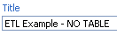
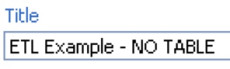
First, change the name of the action sequence from ETL Transformation to ETL Transformation – NO TABLE
200708151647

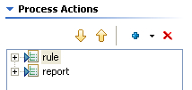
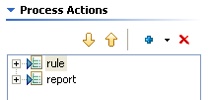
Second, remove the “relational” data that is producing the data for the report by highlighting the step named “rule” and then hitting the RED X to remove it.
200708151649
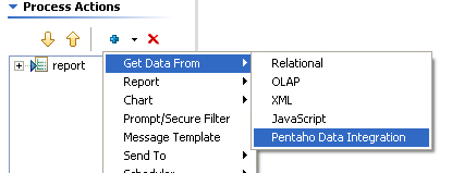
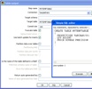
Third, add a Get Data From Pentaho Data Integration step ABOVE the report step.

200708151651

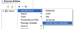
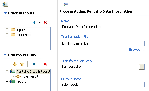
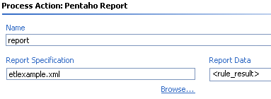
Fourth, configure the Pentaho Data Integration as follows.

200708151650

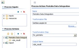
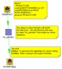
Some notes about what we’ve just done there. We’ve told it the name of the Kettle transformation we’d like to use to get our data is kettleexample.ktr. There are two other important pieces of information we’ve filled in on that screen as well. We’ve told the component that we’ll get our data (rows) from the step named “for_pentaho.” The component will SLURP data from that step and stream it into the result. The other piece of information we’ve given to the component is what we want to name the result set so that the report knows where to get the results. Name the result set “rule_result.”

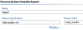
Finally, highlight the report step and make sure that the report is getting its data from “rule_result” but we shouldn’t have to change anything else about the report. Just where it was getting its data.
200708151658

Step 8. Test your EII version of your same report

Navigate to find your new report you created that uses the Kettle ETL transformation INSTEAD of the table.
200708151658-1

Click on ETL Example – NO TABLE and you should see the same data/report.
200708151659

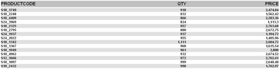
This report is NOT using MYTEMPTABLE and is instead, peering inside of kettleexample.ktr and getting its data from “for_pentaho” and generating the report.

Congratulations! You now have a method that you can use to create EII reports using the same visual tools as when normally developing against a relational source. Imagine the possibilities…. what you can do in Kettle (pivot, unpivot, lookup, calculate, javascript, excel, flat file, web service, XML streaming, call database procedures, and on and on and on) you can do for your reports.

Feedback welcome. The zip file for this example here. I built this example on 1.2 Demo Server GA but should work on 1.6 as well. All you need to do is unzip the file above into pentaho-demo/pentaho-solutions/samples/etl and you should have another working example.

Simple Chart from CSV File

There was some requests on the Pentaho Data Integration forums for an example of how to generate a simple chart from a CSV file.

Sometimes people get so lost in the technology, that it’s tough to just do something pretty simple.  I totally get that.  Pentaho still has plenty of room for improvement on the usability, especially for people coming to the platform for the first time.

Well, here tis.

Unzip examplecsv.zip to pentaho-demo/pentaho-solutions/samples/etl/ in the sample server.

Basically, the idea is to turn a csv file (example.csv):

Year,PresentsNickReceived,PresentsRequested
2003,7,4
2004,9,8
2005,8,9
2006,11,8

into this chart

The confusing part, I’m guessing from the thread, was how data gets from KETTLE to PENTAHO.

Not hard at all actually.

Pentaho initiates (ie, calls Kettles API) the Kettle transform and then “slurps” in memory records from a specified step.  It’s the UNIX equivalent of the “tee” utility where you’re just watching data arriving at a certain place.  In this example, I’ve made it even more explicit by naming the “dummy” step “for_pentaho” so that it’s clear the step that Pentaho is “slurping” the data from.

After that, it’s just a matter of building a chart like any other in the platform.

Turn Pentaho demo into a "server"

The standard Pentaho demo download is super quick and easy: there’s no installation and it just works.  You double click start-pentaho.bat and then it’s running in http://localhost:8080.

However, sometimes you may want to share this demo with others.  Roland Bouman has a nice blog entry on the specifics of how to change the demo install into a server. 

I add the following line to my start-pentaho.sh to make the hostname changing transparent. 

sed -i -e “s/http:\/\/.*:8080/http:\/\/`hostname -f`:8080/” jboss/server/default/deploy/pentaho.war/WEB-INF/web.xml

This allows one to move this “pentaho” to any system and it will startup properly with the http://actualhostname.company.com:8080 instead of http://localhost:8080.  I download a new build of Pentaho on about a weekly basis in addition to preparing virtual machines and zipped installs for customers, partners.  This little shortcut is an absolute must for me; it doesn’t make sense in the actual code release for a variety of reasons.

Perhaps someone else will find this little tidbit useful!  Enjoy!

Trend Lines in Mondrian

I often mouth off on the importance and power of getting your data into a star-schema and Mondrian; the power you have to respond to time variant and analytic needs of your users is immense.  In the next few weeks I’ll cover more about these powers in a more concrete form, showing specific examples instead of just alluding to them.

Starting with a relatively straightforward implementation of a Trend Line.  Traditionally a trend line is built using a good old fashion linear regression on a set of data and then used to calculated current and future X and Y coordinates.  This usually involves some knowledge about building the linear regression formula, and then calculating points based on it.  Fortunately for us, we can skip most of this tedious process and just use an MDX function, LinRegPoint, to sort out most of that difficulty and we’ll just enjoy a beautiful trend line on our graph.

Let’s start with the output, so it’s clear what we’re talking about:

The RED is the data set, and the BLUE is the trend line we’ve built using MDX.

The only thing you need to run through this tip is the Pentaho Demo download, available at http://www.pentaho.org/download/latest.  I used 1.2RC2 for this example, but it should work on versions more recent than that.  It’s zero installation and starts up with everything you need for this tip.

Start up pentaho (start-pentaho.bat) and hop into your web browser (http://localhost:8080).  Navigate to the “Samples” section and into “Steel Wheels.”  Steel Wheels is an example we’re shipping with the demo installation now which provides some great time variant data examples (needed to do interesting things with OLAP).  Steel Wheels data is the sample data provided by the BIRT folks at Eclipse, actually.

Navigate to the Analysis folder, and then to “01. Territory Analysis by Year.”  It doesn’t really matter which one, we just need to get into JPivot on our Steel Wheels cube. 

Click on the MDX button and paste the following MDX fragment to get a base “sales view” and hit Apply:

select {[Measures].[Sales]} ON COLUMNS,
  {[Time].[Months].Members} ON ROWS
from [SteelWheelsSales]
where [Customers].[All Customers]

You should get a result that looks like this:

Ok… Now it’s time to build our Calculated Member.  This is kind of hairy: it requires some technical prowess to get the MDX calculation correct.  Just remember, once you’ve got the calcuation working properly you can include it as part of the Cube so your business users (using JPivot or Pentaho Spreadsheet Services) don’t see that complexity.

We’re going to use an MDX function, named LinRegPoint (reference link). I think the best online tutorial was done by Mosha Pasumanksy in his blog entitled “Using Linear Regression MDX functions for forecasting”  I used his tutorial to help build the regression below!  I won’t get into the details of linear regressions; you can read the reference or do some other googling for Linear Regressions. 

Basically, you rank Time to get straight numbers (X coordinates: 1,2,3,4,5), use your measure Sales as your value to regress (Y coordinates: 129754, 140836, …) and then you get it the ranked time as INPUT to your Linear Regression (which time is this) and it CALCULATES the Y output based on the Linear Regression it’s built.

Our LinRegPoint MDX formula comes down to:

LinRegPoint(
  Rank(
     [Time].CurrentMember,
     [Time].CurrentMember.Level.Members),
  {[Time].CurrentMember.Level.Members},
   [Measures].[Sales],
   Rank(
       [Time].CurrentMember,
       [Time].CurrentMember.Level.Members)
)

Enter the following MDX Fragment into the MDX editor to see the results of the Linear regression on Steel Wheels.

with member [Measures].[Line] as
‘LinRegPoint(Rank([Time].CurrentMember,
[Time].CurrentMember.Level.Members),
{[Time].CurrentMember.Level.Members}, [Measures].[Sales],
Rank([Time].CurrentMember, [Time].CurrentMember.Level.Members))’
select Crossjoin({[Markets].[All Markets]}, {[Measures].[Sales], [Measures].[Line]}) ON COLUMNS,
  {[Time].[Months].Members} ON ROWS
from [SteelWheelsSales]
where [Customers].[All Customers]

And you should see the following output:

Note: if you want to see the graph on the right, change the chart settings (icons at top of page) to be a Horizontal Line chart, Width = 300 and Height = 600.

The steel wheels only has data extending to [2005].[May].  If we had “time” members extending beyond our data set the line would extend to the future.  Careful; a simple linear regression is not best practice for doing forecasting on MANY things.  However, business users like to see the overall trend, and slope.

Was this helpful?  What would you like to see next?  Rolling Averages?  It’s VERY IMPORTANT to note that in most circumstances “MDX examples” for Microsoft Analysis Services works with Pentaho.  There’s a dirth BUNCH of articles about MDX on MSAS… That’s a wealth of tutorials that apply to your work with Pentaho.

Sales Percent increase month to month, qtr to qtr

This is a common situation:  Don’t show me what my total sales figures were month after month, show me something that describes something important to my business.  ie, Sales Growth

Chris Webb, who runs a wildly popular MSFT blog in addition to being an in demand independent consultant, wrote an article on Previous Period Growth using Pentaho.  Mondrian (Pentaho Analysis Server) uses MDX, a powerful expressive multidimensional query language which Chris is one of the leading experts on its practical use and applications.

Chris outlines how to build a “custom” calculated measure that displays the Sales Previous Period Growth:

All you need is the zero install pentaho demo installation to run through his tech tip, available at http://www.pentaho.org/download/latest.php

Remember, this isn’t trivial (ie, writing MDX fragments) but it’s VERY VERY powerful.  Check out the Mondrian MDX reference here for some of the powerful analytic calculations available.  Remember, once you’ve got your MDX member working properly HIDE that complexity from your users by adding it to the Mondrian OLAP schema definition.

Mondrian: OLAP power at your USERS fingertips

As promised, todays followup on how to limit the complexity of calculated MDX measures from your users using Mondrian.

If you haven’t already, start with yesterdays blog, entitled Mondrian: OLAP power at your fingertips. We leveraged the power of MDX to quickly build a calculated MDX member. While in and of itself not all that powerful (% of total is not that tough) it provides with a quick and easy way for users to start exploring the power of MDX without having to do any XML editing, etc. You can just type it into the web browser and “try before you buy.”

Ok, so let’s say you’re sold. You’ve got your calculated measure exactly how you want; great. There’s no WAY that you’d want your users to have to see that and copy and paste that in themselves. It also leaves room for people changing formulas, which in the day and age of SOX is just a bad idea. What you want to do is make this MDX part of your Cube so that a user can just reference it, and disregard the complexity of the expression.

  1. I’m assuming that we’ve already downloaded and started the Pentaho Demo. Refer to yesterdays blogs for instructions.
  2. Edit the file $PROOT/pentaho-demo/pentaho-solutions/samples/analysis/SampleData.mondrian.xml.
  3. Add the following XML fragment right before the ending Cube tag.
    <CalculatedMember name=”Position Percent of Total” dimension=”Measures” formula=”([Measures].[Actual] / ([Measures].[Actual], [Positions].CurrentMember.Parent))” />

    What we’re doing here is tell Mondrian that we want to add a new member named Position Percent of Total to the Measures dimension (a special dimension) using the forumla we worked out yesterday. In theory, this can be any calculated member you’ve sorted out in MDX which means the full power and expressiveness of MDX can be included here.
  4. You should stop and start the server so that mondrian can pick up the schema changes.
    $PROOT/pentaho-demo/stop-pentaho.bat
    $PROOT/pentaho-demo/start-pentaho.bat
  5. Return to the analysis samples (refer to former blog to find it) and launch the slicer Slice and Dice example. Click on the Cube Navigator and then Measures to see if your new “CalculatedMember” is present:

    It should be there so that you can just uncheck the rest of the measures and only have Actual and Position Percent of Total. This is now the experience that your users would have, if they use JPivot here in the web or say the Pentaho Spreadsheet Services (a blog on that next week).
  6. If you expand the All Positions you should see your calculated measure displayed alongside the Actual measure

That’s it! This is really useful for providing your users a bunch of reusable measures (YTD, Versus Period Prior, etc) without having them have to hack it all day in Excel. Enjoy!

Mondrian: OLAP power at your fingertips

Pentaho Analysis (aka Mondrian) is a powerful OLAP tool that can wrap just about any JDBC datasource and present it multidimensionally.  There are many resources that cover how to get Mondrian connected to a database, some of the ins and outs of the the Mondrian.xml schema definition, etc.  Comment below if you’re also interested in seeing a tutorial here in that regard.

Connecting from MDX to usefullness isn’t always the easiest… How powerful is MDX?  Why would I do something in MDX versus SQL?  Why not build another measure in my fact table to support that query instead of MDX?  Well, I won’t belabor the benefits of MDX and the expressiveness of the language – there are plenty of great books and resources in that regard.

Suffice to say that it makes certain analytic queries (Year to Date, % contribution to total, this versus period prior) easy… sometimes embarrassingly easy compared to what we used to do in pure "star schema relational and SQL group by" land.

Let’s build a custom MDX measure and then in a followup I’ll show how provide this to your end users in Mondrian without this complexity.

  1. Download the latest pre configured installation (aka DEMO) of Pentaho here:
    http://www.pentaho.org/download/latest.html
  2. Unzip it into a directory on your local machine (we’ll refer to this as $PROOT from here on out).
  3. Double click on "$PROOT/pentaho-demo/start-pentaho.bat."  When you see the message "Pentaho BI Platform Ready" the platform is ready, about 2 minutes.
  4. Open up firefox (or IE) and go to the following URL
    http://localhost:8080, and then click on Samples and Examples
  5. Find Analysis examples, and click on that

    and then click on
  6. You are now viewing the JPivot application that allows you to navigate and build OLAP reports in a web browser.
  7. (Optional Step) Feel free to explore the JPivot interface at your own leisure, a great place to start is the CUBE NAVIGATOR() which gives a pretty good graphical way of navigating OLAP cubes:  Make changes, and then click on OK to make the crosstab report below change.
  8. Click on MDX to open up the MDX Editor Window
  9. Paste the following MDX into the text area and then hit APPLY:

    select NON EMPTY {[Measures].[Actual]} ON COLUMNS,
    NON EMPTY Hierarchize(Union({[Positions].[All Positions]}, [Positions].[All Positions].Children)) ON ROWS
    from [Quadrant Analysis]

    You should see the report look like this:

  10. What we’re seeing here is the rollup of all of our head count (ie, salary expenditures) by position.  The aggregate figure is nice, for the bean counters, but of interest to the analyst and executives is the "that is that in proportion to my entire enterprise?"  In other words, 1,211,073.00 on HR Training personnel is not as interesting as what % I spend on HR Training personnel as part of the total.  Let’s open paste the following calculated member into the MDX window ABOVE the current MDX statement:
    with member [Measures].[Position Percent of Total] as ‘([Measures].[Actual] / ([Measures].[Actual], [Positions].CurrentMember.Parent))’, format_string = "|#.00%|"

    Click APPLY and then Close the MDX editor (red X or the MDX button again).

    What we’ve done here is built a calculated measure that using MDX.  MDX is very powerful so I suggest you check out some MDX books or resources on the net to explore its capabilities.

  11. Now we need to add our brand new calculated measure to our report.  Click on the cube navigator, then "Measures" then highlight the new Measure we just created:

    You have to click OK twice here to get back to the report.
  12. If all has gone well, you should see the following report with your custom MDX measure:

Well, that’s great for the techies and hard core business analysts, but we’d never want to have to have an end user to have to figure all that out.  How do we buffer the user from that complexity?  That will be tomorrows blog entry on how to make a CalculatedMember in Mondrian. 

Bonus Screenshot of a pie chart in two clicks now based on our percentage:

Reporting in 60 seconds with Oracle XE

Ok, well maybe not 60 seconds but more like 5 minutes.

Some great news today from Pentaho.  Pentaho has purchased proprietary software for visually building reports and donated it to the open source community.  The full text of the announcement is here:

 More on this in a later post… Let’s get to the bits.

Much of what I’ve been hearing in the marketplace is the perception that Open Source has hidden costs in terms of usability and the technical savvy needed of users. 

Let us try and challenge this assumption and see how "productive" we can be building a simple database driven report.

Download the Report Designer here and unzip it to a directory of your choosing.  There’s zero installation required (you’ll need Java on your computer, but that’s pretty prevalent these days).  Double click on the bat file (or .sh if you’re using linux).

When the product launches you’ll notice a panel that allows you drag and drop elements onto the canvas in an easy to use fashion.  I’m sure additional tutorials will come on this blog and Pentaho.org but suffice to say, this is an interface which is easy enough to just "figure out" by playing with it.

The "RED" circle is our palette and the "BLUE" area is our canvas.

Let’s get going and start our report!

  1. Launch the Report Wizard
  2. Select the option that indicates that you will use your own dataset, a JDBC dataset
  3. Enter in the connection information and driver location for your database.  I keep the latest Oracle Express edition (a Free version of the Oracle database) around.
    Note:  You don’t have to do anything special with the JDBC driver (put it in a lib directory or anything).  All you have to do is show the wizard where the .jar file is.

    I’m using the HR schema which comes with the Oracle database for testing/sample purposes.
  4. Navigate to find the "EMPLOYEES" and "DEPARTMENT" tables.  Enter in a simple SQL query that contains the data of interest and use the very handy Preview Option to make sure you’re getting the results desired.

    Feel free to just copy and paste if you are using XE as well:
    select
    d.department_name "Department Name",
    e.first_name "First Name",
    e.last_name "Last Name",
    e.phone_number "Phone Number"
    from
    employees e, departments d
    order by d.department_name
  5. You can just click Next on the visible feilds screen:
  6. Highlight "Department Name" and add it to the grouping and hit "Finish"
  7. It should return you to the original canvas where you can see the design of your report.  From here you can start to add images, lines, change fonts, etc.  Have fun exploring the richness of the options available here.
  8. Let’s see what it looks like!  Click Preview and page through your report!

That’s it!  You’re done!  You’ve created a report that can be parameterized, hosted, bursted, distributed in just a few minutes.  In a follow on blog I’ll show you how to publish this into the Pentaho server (it’s only about 2 more steps).

Happy Trails!