Make Mondrian Dumb

I had a customer recently who had very hierarchical data, with some complicated measures that didn’t aggregate up according to regular ole aggregation rules (sum, min, max, avg, count, distinct count). Now, one can do weighted averages using sql expressions in a Measure Expression these rules were complex and they also were dependent on the other dimension attributes. UGGGGH.

Come to that: their analysts had the pristine, blessed data sets calculated at different rollups (already aggregated to Company Regions). Mondrian though, is often too smart for it’s own good. If it has data in cache, and things it can roll up a measure to a higher level (Company Companies can be rolled up to Regions if it’s a SUM for instance) Mondrian will do that. This is desirable in like 99.9% of cases. Unless, you want to “solve” your cube and just tell Mondrian to read the data from your tables.

I started thinking – since their summary row counts are actually quite small.

  1. What if I could get Mondrian to ignore the cache and always ask the database for the result? I had never tried the “cache=” attribute of a Cube before (it defaults to true and I work with that 99.9% of the world). Seems like setting it to false does the trick. Members are read and cached but the cells aren’t.
  2. What if I could get Mondrian to look to my summary tables for the data instead of aggregating the base fact? That just seems like a standard aggregate table calculation. Configure an aggregate table so Mondrian will read the Company Regions set from the aggregate instead of the fact

Looks like I was getting close to what I wanted. Here’s the dataset I came up with to test:

mysql> select * from fact_base;
+----------+-----------+-----------+
| measure1 | dim_attr1 | dim_attr2 |
+----------+-----------+-----------+
| 1 | Parent | Child1 |
| 1 | Parent | Child2 |
+----------+-----------+-----------+
2 rows in set (0.00 sec)

mysql> select * from agg_fact_base;
+------------+----------+-----------+
| fact_count | measure1 | dim_attr1 |
+------------+----------+-----------+
| 2 | 10 | Parent |
+------------+----------+-----------+
1 row in set (0.03 sec)

mysql>
Here’s the Mondrian schema I came up with:

<Schema name=”Test”>
<Cube name=”TestCube” cache=”false” enabled=”true”>
<Table name=”fact_base”>
<AggName name=”agg_fact_base”>
<AggFactCount column=”fact_count”/>
<AggMeasure name=”[Measures].[Meas1]” column=”measure1″ />
<AggLevel name=”[Dim1].[Attr1]” column=”dim_attr1″ />
</AggName>
</Table>
<Dimension name=”Dim1″>
<Hierarchy hasAll=”true”>
<Level name=”Attr1″ column=”dim_attr1″/>
<Level name=”Attr2″ column=”dim_attr2″/>
</Hierarchy>
</Dimension>
<Measure name=”Meas1″ column=”measure1″ aggregator=”min”>
</Measure>
</Cube>
</Schema>

Notice that the aggregate for Parent in the agg table is “10” and the value if the children are summed would be “2.” 2 means it agged the base table = BAD. 10 means it used the summarized data = GOOD.

The key piece I wanted to very is that if I start with an MDX for the CHILDREN and THEN request the Parent will I get the correct value. Run a cold cache MDX to get the children values:

200902181235

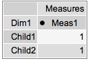
Those look good. Let’s grab the parent level now, and see what data we get:
200902181235-1

The result is 10 = GOOD! I played around with access methods to see if I could get if messed up and on my simple example it didn’t. I‘ll leave it to the comments to point out any potential issues with this approach but it appears as if setting cache=”false” and setting up your aggregate tables properly will cause Mondrian to be a dumb cell reader and simply select out the values you’ve already precomputed. Buyer Beware – you’d have to get REALLY REALLY good agg coverage to handle all the permutations of levels in your Cube. This could be rough – but it does work. 🙂 And caching – it always issues SQL so that might be an issue too.

Sample: cachetest.zip

Mondrian – you’ve been dumbed down! Take that!!!

Self Service Data Export using Pentaho

Every BI installation has power users that just want “data dumps.” They may need the dumps for a variety of reasons:

  • You’ve built crappy reports. They can’t get the information they need in *YOUR* reports.
  • They need to feed the data into another system. They want to select all customers who bought product X in time period Y to send them a recall notice. Need a dump of email / addresses to send them the notice.
  • They are addicted to Excel; they feel like a super hero whizzing through the data making fancy graphs and doing a few of their own ratios/calculations.
  • They want to munge the numbers. They will export it to Excel, throw out the data that makes them look bad, and then present it to their boss with shiny positive results.

I had a customer who needed something to “feed the data to another system.” Their original approach was to write a Pentaho Report that formatted to CSV well, write the parameterized query, and then simply generate the report and return it in the browser. This seems like a sound approach and would have been my first as well. They found that it did work well, to a point. It looked as if the Pentaho Report layer tends to use a bunch of memory for report generation – this is understandable. The report object is being rendered but is only “returned” to Pentaho when it’s complete. The entire dataset must be in memory. Well, needless to say, with this customers heap configuration they found a row threshold (30,000) that caused their Pentaho 1.6 installation to croak.

However, they didn’t really need to be using Pentaho Reporting. Kettle, which is included in Pentaho BI Suite has an straightforward performant way to export to CSV. If we could generate that file, and then simply return the file that we just generated to the browser we’d have an elegant solution for data export.

The first piece of the puzzle is the data export KTR. This KTR takes two arguments: Country and Filename. The Country is the value that will limit the data set that we are outputing (output customers in Italy). The Filename is the location to put the file. This isn’t necessary, but it allows the FILENAME to be set by the caller (.xaction) instead of callee (ktr). It’s for convenience.

200902090955

I’ve created a directory in tomcat/webapps/ named “lz”, short for landing zone. This /lz/ directory is accessible via the web browser. By placing this in this location we can use the same tomcat server that is hosting Pentaho to serve up our data export file as well.

Now, let’s get to a little bit of the magic of the Action Sequence, data_export.xaction.
200902091000

The first thing this action sequence does is to create a list of countries, and then prompt the user to select one. This is pretty standard stuff, done all the time with Pentaho reports so we won’t cover the specifics here.

Once we’ve got our “country” defined, we call our “Pentaho Data Integration” KTR component with two arguments. The first is the country the user has just selected and the second is the filename that we’ve hard coded as an input to our action sequence. The filename is the location on the local filesystem you would like kettle to generate the file at (ie, /apps/pentaho/tomcat/webapps/lz/data_export_file.csv).

Once we’ve generated the file in that location, we’ll send a redirect to the user as the “output” of this action sequence. The user doesn’t really “see” this; the user will just see the .csv arrive in their browser. The way to get the redirect to work is to add the output to “response.redirect” like so:
200902091005
The redirect URI is another hard coded value: /lz/data_export_file.csv which should reference the path of the file on the web server.

The user experience is indistinguishable from standard reports. User is prompted:

200902091010

they click “OK” and are prompted what do do with their export.
200902091011

The performance of this solution far surpasses using Pentaho Reporting. Exports of 10,000 rows that were taking 30-60 seconds were taking 10-15 seconds. However, be warned. The export via Kettle will only have as many formatting options as are present in the “Text File Output” step which are many, but limited. If you need fine control over the format of your data export, you may have to stick with Pentaho Reporting since it does provide a superior set of layout/formatting controls.
It should also be noted that this works with zipped files (to zip up the .csv), and also .XLS exports. I’ve provided this sample (data_export.zip) that works with Pentaho 2.0 BI (Needs hypersonic sample database). You’ll have to adjust the “filename” variable to your filesystem before running it for it to work properly (it has the location of my installation).

The death of prevRow = row.clone()

UPDATE: This step is available in Kettle 3.2 M1.

For those that have done more involved Kettle projects you’ll know how valuable the Javascript step is. It’s the Swiss Army knife of Kettle development. The calculator step is a nice thought, but the limited set of functions and the constriction of having to enter it in pulldowns can make more complex calculations more difficult.

Those that have done “observed metric” type calculations in Kettle will know this bit of Javascript well:

var prevRow;
var PREV_ORDER_DATE;

if ( prevRow != null && prevRow.getInteger(“customernumber”, -1) == customernumber.getInteger() )
PREV_ORDER_DATE = prevRow.getDate(“orderdate”, null);
else
PREV_ORDER_DATE = null;

prevRow = row.Clone();

This little bit of Javascript allowed you to “look forward” (or back depending on your sorting) and calculate the difference between items:

  • Watching a set of “balances” fly by and calculate the transactions (this balance – prev balance) = transaction amount
    Web Page duration (next click time – this click time) = time spent viewing this web page
    Order Status time (next order status time – this order status time) = Amount of time spent in this order status (warehouse waiting)

In other words, lining data up and peaking ahead and backwards is a common analytic calculation. In Oracle/ANSI SQL, there’s a whole set of functions that perform these type of functions.

This week I committed to the Kettle 3.2x source code a step to perform the LEAD/LAG functions that I’ve had to hand write several times in Javascript. It’s been long overdue as I told Matt I designed the step in my head two years ago and he’s been patiently waiting for me to get off my *ss and do something about it.

You can find more information about the step on its Wiki page, along with a few examples in the samples/transformations/ directory.

The step allows you peek N rows forward, and N rows backward over a group and grab the value and include it in the current row. The step allows you to set the group (at which to reset the LEAD/LAG), and setup each function (Name, Subject, Type, N rows)
200901301239
Using a group field (groupseq) and LEADing/LAGing ONE row (N = 1) we can get the following dataset:
200901301238
Any additional calculations (such as the difference, etc) can be calculated like any other fields.

This was my first commit to the Kettle project, and a very cool thing happened. I checked in the base step and in true open source fashion, Samatar (another dev) noticed, and created an icon for my step which was great since I had no idea what to make as the icon. Additionally, hours after my first commit he had included a French translation for the step. He and I didn’t discuss it ahead of time, or even know each other. That’s the way open source works… well. 🙂

RIP prevRow = row.clone(). You are dead to me now. Long live the Analytic Query step

select stream REAL_TIME_BI_METRIC from DATA_IN_FLIGHT

SQL is great. There are millions of people who know it, it’s semantics are standardized (well, as much as anything is ever I suppose), and it’s a great language for interacting with data. The folks at SQLstream have taken a core piece of the technology world, and turbocharged it for a whole new application: querying streams of data. You can think of what SQLstream is doing as the ‘calculus’ of SQL – not just query results of static data in databases but query results of a stream of records flowing by.

Let’s consider some of the possibilities. Remember the results aren’t a one time poll – the values will continue to be updated as the query continues.

// Select the stocks Average price over the last 10 ticks
select stream stock, avg(price) over (previous 10) from stock_ticker group by stock
// Get the running averages for the past minute, hour, and day updated
select stream stock, avg(price) over (range interval 1 minute preceding) as “AvgMinute” , avg(price) over (range interval 1 hour preceding) as “AvgHour”, avg(price) over (range interval 1 day preceding) as “AvgDay” from stock_ticker group by stock;

For a variety of reasons, I haven’t posted my demo of my real time BI analytics powered by SQLstream but figured it’s about time to at least talk about it. The demo is illustrative of a the BASIC capabilities of the SQLstream RAMMS (Relational Asynchronous Messaging Management System). Trust me, the simple stream queries I wrote are about as trivial as possible. The more complex the business needs the fancier the SQL becomes, but that’s the point where the demo turns into a real customer project.

You can’t see it in just the still image below, but the bars in the bar chart are “dancing” around as events are flowing from SQLstream. It’s very very cool to watch a web dashboard update with no interaction. There’s a huge data set of stock prices being INSERTed into a stream via JDBC from one application and there’s a stream select that gives a windowed “% Change” of stock price. The application simply gets the “Stock / % Change” values over JDBC with all the complex windowing, grouping etc being done by SQLstream.

200901271717

SQLstream have announced the 2.0 release of their product. Some of you may be curious as to where the 1.x version of their product has been. To date, SQLstream hasn’t made much fanfare about their products. They’ve been selling to customers, working with the Eigenbase foundation, and have released several versions of their product over that past few years. I’ve had the chance to work with the 1.x series of their product and an early release candidate of their 2.x series and think it’s very very compelling. I very much look forward to digging into the new 2.x features soon.

In particular, and what I continue to find most fascinating, is the new aggregation features in 2.x. This will allow users of ROLAP type query systems (or simply companies with summary/aggregate tables they spend time updating) to keep these tables up to date throughout the day. This is a huge win for companies that have to update summary tables from huge transaction data sets.

Consider a common problem batch loading window. You load a million records / day. You do period batch updates of your transactions throughout the day and at midnight you kick off the big huge queries to update the “Sales by Day”, “Sales by Month”, “Sales by Qtr”, “Sales by Year”, “Sales All Time” summary tables that take hours to rebuild (going against huge fact tables). Missing the batch window means reports/business is delayed. SQLstream can ease this burden. SQLstream is efficiently calculating these summaries throughout the day (period batch loads) and at midnight simply “spits out” the summary table data. That’s a huge win for customers with a lot of data.

If you’re loading millions of records per day and you need to keep summaries up to date or have time sensitive BI applications you should definitely consider SQLstream. If you’re interested in discussing real time BI or the benefits of streaming aggregation don’t hesitate to contact Bayon ; we can help you prototype, evaluate and build a SQLstream solution

PentahoFlashChart: Basics

PentahoFlashChart is a component built for Pentaho 2.0.stable (or Enterprise Edition) that allows you to render flash charts in the User Console and Dashboards. It uses the flash library “Open Flash Chart 2.0” which is an LGPL licensed SWF. The charts are NOT available for rendering in Pentaho Reporting or Pentaho Report Designer.

Let’s first understand what we’re talking about: Consider the following example run from Bayon’s ‘demo’ server.

NOTE: This demo server is not a 100% uptime server – if you don’t see anything above don’t worry. Check back later.

A chart can be rendered via a URL:

200901081053

via the Pentaho User Console:

200901081054

via Dashboards (JSP/AJAX/CDF):

200901081055

The PentahoFlashChart component is intended to be used, like any other component, from an .xaction which is created in the Pentaho Design Studio.

You can follow download this example here: ofc_linechart.xaction

Just like any chart or report, you have to get your data for reporting. In this case, we’re getting a Relational data set from the Pentaho SampleData data source.

200901081059

We also have a “chart template” which is an XML document VERY similar (same same but different) to the pentaho chart xml definition that defines how to build the chart. It contains things like chart tile, chart type, etc. The “chart template” is really where most of the “interesting” work occurs.

<chart><chart-type>LineChart</chart-type><title>Line Chart–Product “1948 Porsche 356-A Roadster”</title><x-steps>1000</x-steps><x-max>20000</x-max><domain-title>Day</domain-title><range-title>Sold Price</range-title><y-axis><labels></labels><y-steps>1000</y-steps><y-max>10000</y-max><color>#909090</color></y-axis></chart>

Notice that this chart template has a <chart-type>LineChart</chart-type> which means that the component will output a LineChart in Open Flash Chart. The full scope of the tags, and all their functioning is beyond the scope of this intro article and it should also change. The next release of PentahoFlashChart should be 100% compatible with the Pentaho Chart XML definition. We’ll see. 🙂

This renders the flash fragment to the page, with a “callback” for the data file that has been added to the content repository.

Consider installing it into Pentaho 2.0.stable and playing with it. The sample solution comes with 11 Examples so it should be relatively easy to get going, even though it lacks good documentation.

200901081110

It’s great for dashboards, and produces some great looking (if not limited) charts.

Happy New Year 2009!

I resisted the urge to post a “2008 recap” and “2009 predictions” since that seemed to be well covered in lots of different circles/blogs.

Ahhh… Who am I kidding? I’m just lazy! 2008 was a crappy year (personally, but not professionally) and 2009 is off to a great start (personally, but not professionally)!

Already I’m very much enjoying 2009 even though the consulting work is shaping up pretty light these first few weeks.

<shamelessplug>
Need any help with Mondrian/Kettle/Pentaho? I’m available for smaller 3-20 day engagements remotely and onsite in North America.
</shamelessplug>

The best part about the start of the year, was I was able to get some time testing, updating, and deploying to my demo server the two projects that Bayon has been sponsoring over the past few months.

JDBCKettle – Allows for Kettle transformations to be used in an EII fashion. This allows you to use a (set of) kettle transformations and access via SQL.

PentahoFlashCharts – Updated to OFC 2.0 and Pentaho 2.0.stable it also includes new XML Template for building charts. Right now it’s diverged from the Pentaho chart standard but I hope to get back to the standard pentaho chart definition before this goes to an initial Beta release.

I’ll be blogging more about these projects in the coming days.

Happy New Year!

An arms race my customers don't care about

Perfect is the enemy of good enough. This is fertile soil for why people choose to use the simpler, functional, cheaper open source cousins of proprietary feature function behemoths. Don’t get me wrong – too few features / crappy performance you lose customers because you’re not helping people solve problems if you lack too many features.

Recently, I observed a thread at the blog of Goban Saor entitled “Open Source Metrics.”

It basically has turned into a discussion which keeps creeping up about which tool is faster: Talend or Kettle. Which leads me to ask the question: Who Friggin’ Cares?

I’m a Kettle Expert so I think Kettle is Wicked Fast.
If I were a Talend Expert I’d think Talend is Wicked Fast.

Performance for customers who are focused on results, and aren’t technophiles boils down to these two requirements

  1. It has to meet my performance requirements for my project. If I have to load 1 million records per day and I have 10 minutes to do that then the tool either does or does not meet that performance requirement.
  2. It has to allow me to grow beyond my current performance requirements. I am loading 1 million records now, but in 3 years I may be loading 100 million records. Given the right investment in tuning and scaling I don’t want to have to change to a different tool when I go much bigger.

For Kettle the answer is pretty simple:

  1. I do a few simple mappings, hit run, do very little tuning/database optimization. Wham-o. 20k records / second throughput. Look and notice Kettle is simply sitting idle waiting for a database lookup. Add an index. Wham-o 35k records / second throughput. Have extra CPUs, fire up a few extra threads of a calculation step. Wham-o 40k / second. Surpasses customer batch window needs sufficiently; enough said. Requirement met – whether 35k records per second is slower or faster than someone else is irrelevant. Requirement met.
  2. This usually involves outside validations. What are other people doing – what are the proof points about the performance. I personally have worked on a Kettle scale out cluster with 5 nodes that reads, sorts, aggregates, and summarizes a billion FAT (wide character) records in an HOUR and scales almost perfectly linearly (* no tool grows at perfect linear). Telling a customer using the exact same binary you have there, you can scale out and process hundreds of millions into billions of records per hour. Requirement met – you can grow with your tool.

I think Kettle performance is superb. I’d welcome Talend folks to comment here and blog about their proof points for how Talend performance is superb. I believe that it is. Let’s just all consider the most important thing: open source ETL is about solving the ETL need well, not necessarily incremental performance differences.

It’s a debate with no winner. I don’t care if your tool is 2.5% faster at reading character text files than mine. I do care if it can scale out (requirement 2) and solves customer problems (requirement 1).

Hidden little trend arrows

Many readers of this blog use JPivot. The solidly average web based Pivot Viewer that I’ve heard described as a “relic” of the cold war – no frills utility software. However, as maligned as JPivot is, it does have some great features and has been production quality software for years now. One of these hidden little features that is in JPivot (and also in Pentaho) is the quick and easy way to add trend lines to a JPivot screen by simply using MDX.

Consider, for instance, this little bit of MDX:

with member [Measures].[Variance Percent] as ‘([Measures].[Variance] / [Measures].[Budget])’, format_string = IIf(((([Measures].[Variance] / [Measures].[Budget]) * 100.0) > 2.0), “|#.00%|arrow=’up’“, IIf(((([Measures].[Variance] / [Measures].[Budget]) * 100.0) < 0.0), “|#.00%|arrow=’down’“, “#.00%”))
select NON EMPTY {[Measures].[Actual], [Measures].[Budget], [Measures].[Variance], [Measures].[Variance Percent]} ON COLUMNS,
NON EMPTY Hierarchize(Union({[Positions].[All Positions]}, [Positions].[All Positions].Children)) ON ROWS
from [Quadrant Analysis]

which produces this lovely set of arrows letting the user know how their individual variance value rates in terms of KPI thresholds.

200811111457

The secret of course, is the arrow= tag in the format string. Easy enough. “up” is a green up arrow. “down” is a little red arrow. “none” is no arrow.

Happy Visual Cue Indicator day to you all.

How to Disable Drill Through on Pentaho Charts

I have some dashboard pages which show charts that are purely informational. They don’t need to click to anywhere. In fact, since I’m loading these charts via AJAX calls I do not want them to be linked. I want them to be images without any URLs and no clicks.

200810031517
All of those bars / lines etc I just want to have hovers (to see the values, but no click through locations).

However, after looking through all the documentation and code for it, I couldn’t find a single way to suppress the generation of hyperlinks for the charts. Sure, I could get the image from the ChartComponent but then I wouldn’t get the hover values. Until it occurred to me. Why not just make a URL link that does nothing?

Adding the following fragment to the chart definition can make the link, in essence, do nothing and not even refresh the page. Meets my needs.

<use-base-url>false</use-base-url>
<url-template>javascript:;</url-template>

Not ideal though. It still shows the user a clickable area so the user may think the application isn’t working properly. I think BISERVER-2222 will be better in the long term but a stop gap measure that helps my customers for sure.

It is FINALLY here – Manage Datasources

Since the very first time I downloaded the Pentaho suite I’ve been wailing, screaming, shouting, snarking that there absolutely MUST be a way to manage data sources that does not involve XML.

Well… Holy Shit. At just under 3 years it’s here (Pentaho Administration Console from 2.0.M3 build):

200810011933

This is a most appreciated feature for those getting started with Pentaho! Thank you to the Pentaho Engineers for whipping it up!
PS – It’s not perfect yet, but should be solid by 2.0 GA