I often mouth off on the importance and power of getting your data into a star-schema and Mondrian; the power you have to respond to time variant and analytic needs of your users is immense. In the next few weeks I’ll cover more about these powers in a more concrete form, showing specific examples instead of just alluding to them.
Starting with a relatively straightforward implementation of a Trend Line. Traditionally a trend line is built using a good old fashion linear regression on a set of data and then used to calculated current and future X and Y coordinates. This usually involves some knowledge about building the linear regression formula, and then calculating points based on it. Fortunately for us, we can skip most of this tedious process and just use an MDX function, LinRegPoint, to sort out most of that difficulty and we’ll just enjoy a beautiful trend line on our graph.
Let’s start with the output, so it’s clear what we’re talking about: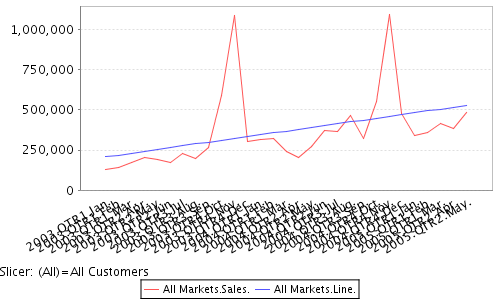
The RED is the data set, and the BLUE is the trend line we’ve built using MDX.
The only thing you need to run through this tip is the Pentaho Demo download, available at http://www.pentaho.org/download/latest. I used 1.2RC2 for this example, but it should work on versions more recent than that. It’s zero installation and starts up with everything you need for this tip.
Start up pentaho (start-pentaho.bat) and hop into your web browser (http://localhost:8080). Navigate to the “Samples” section and into “Steel Wheels.” Steel Wheels is an example we’re shipping with the demo installation now which provides some great time variant data examples (needed to do interesting things with OLAP). Steel Wheels data is the sample data provided by the BIRT folks at Eclipse, actually.
Navigate to the Analysis folder, and then to “01. Territory Analysis by Year.” It doesn’t really matter which one, we just need to get into JPivot on our Steel Wheels cube.
Click on the MDX button and paste the following MDX fragment to get a base “sales view” and hit Apply:
select {[Measures].[Sales]} ON COLUMNS,
{[Time].[Months].Members} ON ROWS
from [SteelWheelsSales]
where [Customers].[All Customers]
You should get a result that looks like this: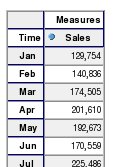
Ok… Now it’s time to build our Calculated Member. This is kind of hairy: it requires some technical prowess to get the MDX calculation correct. Just remember, once you’ve got the calcuation working properly you can include it as part of the Cube so your business users (using JPivot or Pentaho Spreadsheet Services) don’t see that complexity.
We’re going to use an MDX function, named LinRegPoint (reference link). I think the best online tutorial was done by Mosha Pasumanksy in his blog entitled “Using Linear Regression MDX functions for forecasting” I used his tutorial to help build the regression below! I won’t get into the details of linear regressions; you can read the reference or do some other googling for Linear Regressions.
Basically, you rank Time to get straight numbers (X coordinates: 1,2,3,4,5), use your measure Sales as your value to regress (Y coordinates: 129754, 140836, …) and then you get it the ranked time as INPUT to your Linear Regression (which time is this) and it CALCULATES the Y output based on the Linear Regression it’s built.
Our LinRegPoint MDX formula comes down to:
LinRegPoint(
Rank(
[Time].CurrentMember,
[Time].CurrentMember.Level.Members),
{[Time].CurrentMember.Level.Members},
[Measures].[Sales],
Rank(
[Time].CurrentMember,
[Time].CurrentMember.Level.Members)
)
Enter the following MDX Fragment into the MDX editor to see the results of the Linear regression on Steel Wheels.
with member [Measures].[Line] as
‘LinRegPoint(Rank([Time].CurrentMember,
[Time].CurrentMember.Level.Members),
{[Time].CurrentMember.Level.Members}, [Measures].[Sales],
Rank([Time].CurrentMember, [Time].CurrentMember.Level.Members))’
select Crossjoin({[Markets].[All Markets]}, {[Measures].[Sales], [Measures].[Line]}) ON COLUMNS,
{[Time].[Months].Members} ON ROWS
from [SteelWheelsSales]
where [Customers].[All Customers]
And you should see the following output: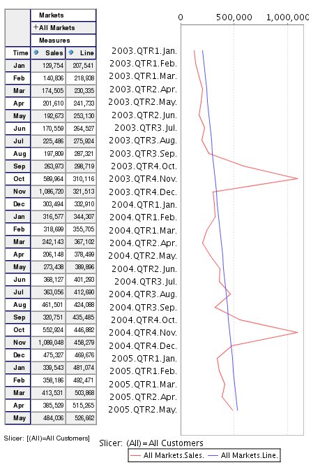
Note: if you want to see the graph on the right, change the chart settings (icons at top of page) to be a Horizontal Line chart, Width = 300 and Height = 600.
The steel wheels only has data extending to [2005].[May]. If we had “time” members extending beyond our data set the line would extend to the future. Careful; a simple linear regression is not best practice for doing forecasting on MANY things. However, business users like to see the overall trend, and slope.
Was this helpful? What would you like to see next? Rolling Averages? It’s VERY IMPORTANT to note that in most circumstances “MDX examples” for Microsoft Analysis Services works with Pentaho. There’s a dirth BUNCH of articles about MDX on MSAS… That’s a wealth of tutorials that apply to your work with Pentaho.
Nice article Nick – I’m enjoying this series.
Note dirth is both spelled wrong and means the opposite of what you intended
http://www.urbandictionary.com/define.php?term=dirth&defid=1165987
I wouldn’t have said anything but first defn on the page above was so funny. 🙂
AWESOME!
The definition John talks about is:
1. dirth
‘imaginary word made by ignorant girls’
Correct spelling is derth.
All to say, it’s absolutely the WRONG word for what I meant. Thanks John! 🙂
Very nice!
A simple question: in the upper figure’s axis labels 2003 Jan .. 2005 May are still readable but I have an example where there is a daily trend over 1 year. The labels are a mess. Is there a way to add “granularity” so that one label out of 10 (or something) would be printed?
Marko
hello, already it connects me to my data base. I want to place my data in JPivot, but not the structure of the example, to change it by my data. The Sampledata and query1.xaction. My Dimensions are Region, Sector, Province. Main table in fact is financing. Data base Investments